When people think of a rebrand, they picture fireworks. A radical new logo splashed across the headlines, bold press releases, maybe even a stunt or two to make sure everyone notices. But in 2025, the world’s biggest names are moving in the opposite direction. Amazon and Adobe, giants with brand equity most businesses can only dream of, are quietly reshaping their visual identities with subtle shifts rather than seismic shocks.
It’s the era of the “quiet rebrand.”
Evolution, Not Revolution
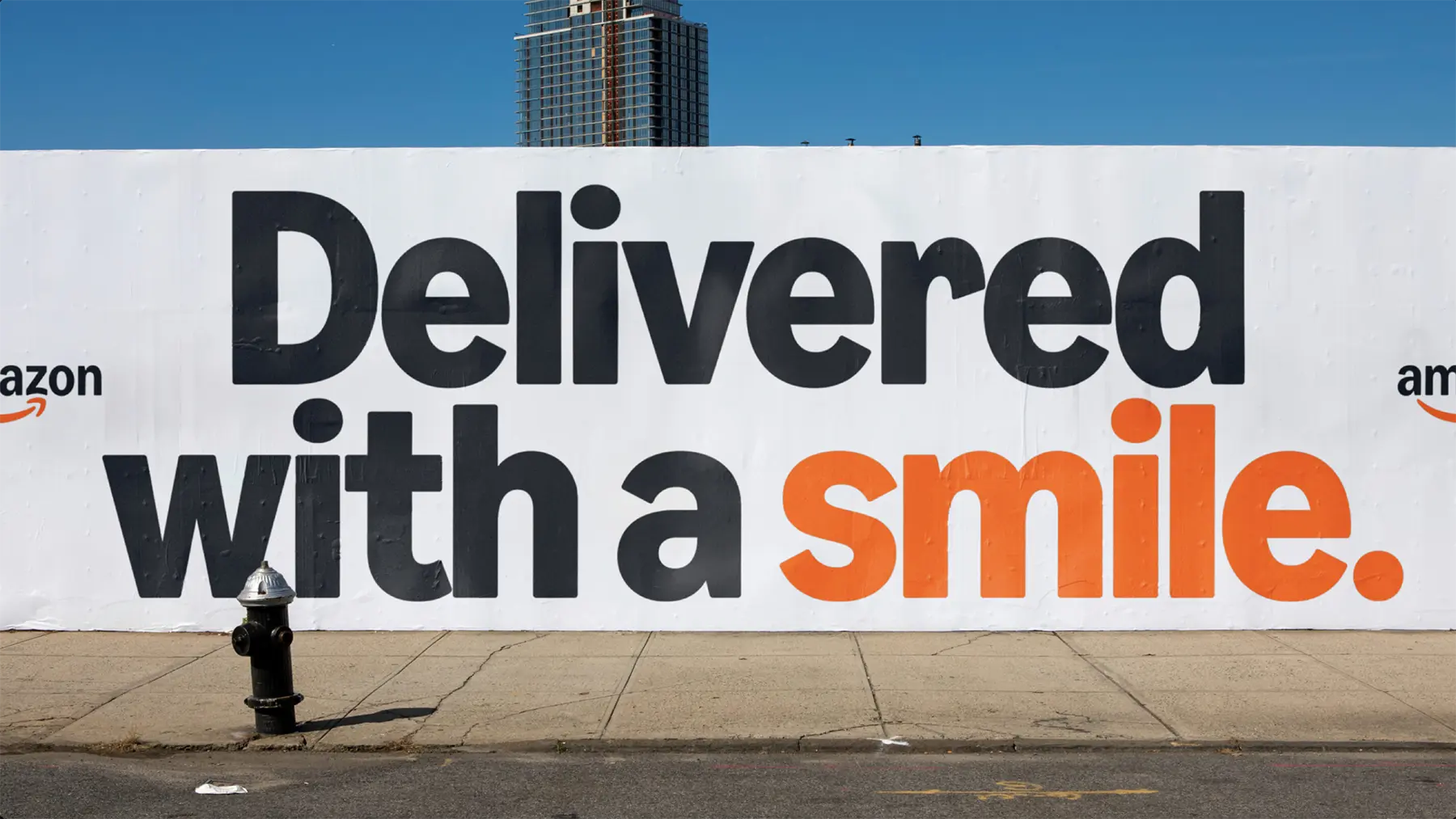
Take Amazon. Their identity refresh, guided by Koto, hasn’t ripped up the rulebook. Instead, it has gently tuned the familiar: the smile refined, the typography tightened, the sprawling family of sub-brands brought into line with a more coherent visual system. For most customers, the changes are invisible. But that’s the point - they simply feel Amazon has become easier to recognise, smoother to navigate, more trustworthy.
Adobe is on a similar path. With Mother Design, they’ve been rolling out incremental refinements: a crisper logo, a more consistent palette, typography that works harder in digital contexts. If you compared Adobe’s brand from five years ago to today, the difference is striking. But year to year? It’s a slow burn.

Why So Quiet?
At one level, the answer is obvious: these companies already hold priceless brand equity. A radical overhaul risks burning recognition and confusing users. But it’s deeper than that.
In today’s landscape, brands are everywhere. A logo needs to live happily on a billboard, an app icon, a shipping label, and the corner of a smartwatch. That demands adaptability, not bravado. It’s also about trust: audiences have grown cynical about splashy redesigns that look like design for design’s sake. Quiet change feels authentic - and authenticity sells.
The Risk of Playing It Too Safe
But here’s the question: if nobody notices your rebrand, does it even matter? Quiet tweaks risk becoming so subtle they pass by unseen, a huge design expense with no story attached. Worse, brands that sand down their edges too much can slide into generic sameness - the corporate “blanding” we’ve all seen too often.
That tension is where the quiet rebrand becomes fascinating: the balance between evolution and invisibility, between refinement and erasure.


What It Means for Everyone Else
Amazon and Adobe can afford to evolve quietly because they’re already household names. But what about challenger brands, local businesses, football clubs? For them, the playbook is trickier. Sometimes subtlety is smart - a careful refresh that modernises without alienating customers and loyal fans. But sometimes boldness is the only way to cut through and to some extent, justify the investment in a brand rethink.
Imagine Swindon Town FC adopting Amazon’s approach: a gentle tidy-up of the badge rather than a dramatic overhaul. Would fans appreciate the respect for heritage, or would they shrug and ask what all the fuss was about? Contrast that with MK Dons’ more visible redesign that embraces local nuances and brings clarity to a club name that's caused plenty of controversy since 'Wimbledon' was relocated to Milton Keynes.
Final Thought
The rise of the quiet rebrand tells us something important: design doesn’t always need to shout. In an age where brands are bombarded with noise, sometimes the smartest move is to quietly shift the needle and get on with business. But for businesses without Amazon’s scale or Adobe’s history, a whisper might not be enough. For most, a rebrand is an opportunity to re-shape, re-think and re-claim attention.
At Bravedog, we believe the real challenge is knowing when to turn up the volume and when to hold back. The danger isn’t in being loud or quiet - it’s in being missed altogether.
If you'd like to talk to us about a brand re-think, or you're not sure what to do next, we can help.