From Crests to Brands: The Evolution of UK Football Club Logos
Football club logos are more than just symbols; they represent the heritage, identity, and passion of teams and their supporters. In the UK, where football has deep historical roots, club crests have evolved over time, reflecting shifts in branding, ownership, and fan culture.
Once, football crests were purely heraldic - emblems of locality, history, and pride. Today, they’re also strategic tools of brand identity, designed to work across global media, merchandise, and digital screens. The evolution of club logos mirrors the professionalisation of football itself: from grassroots sport to billion-pound entertainment industry.
A Brief History of the Crest
In the early days of British football, club badges were simple, often borrowed from civic coats of arms. Arsenal’s cannon, Manchester United’s ship and devil, and Chelsea’s lion all trace their origins to local history or geography.
These motifs were embroidered on kits with little thought to marketing, but by the 1970s and 80s, design began to matter. Clubs realised their crests were appearing not just on shirts, but on scarves, programmes, and increasingly, TV broadcasts.
With that came a new challenge: consistency. Many clubs simplified or redrew their badges to improve reproduction - a step that gradually transformed these emblems from community marks into corporate brands.
1. Manchester United: The Red Devil’s Evolution
Manchester United’s logo has undergone several transformations since the club’s inception in 1878 as NewtonHeath. Originally, the crest featured a railway motif, reflecting the club's ties to the Lancashire and Yorkshire Railway. However, the modern logo found its roots in the 1940s and 50s when the team adopted the nickname "The Red Devils."
Key Changes:
- 1960s: The introduction of the Red Devil holding a trident was inspired by the club's aggressive playing style and branding.
- 1973: The club adopted a simplified crest, placing greater emphasis on the Red Devil emblem.
- 1998-Present: The crest remains largely unchanged, with a shield-like structure and bold typography reinforcing the club’s global identity.
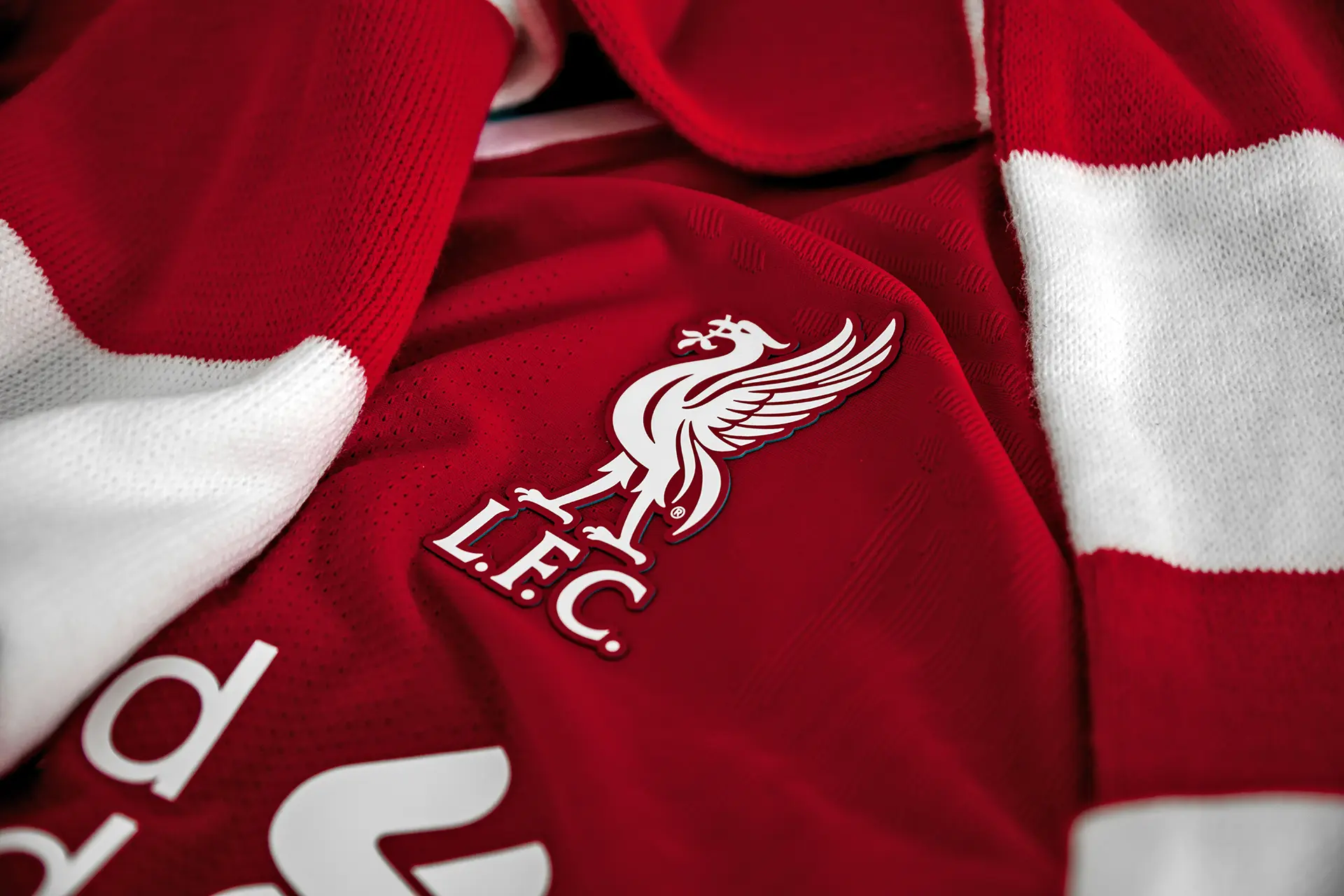
2. Liverpool FC: The Everlasting Liver Bird
Liverpool’s badge has always featured the Liver Bird, a mythical creature that symbolises the city ofLiverpool. Since its establishment in 1892, the club’s crest has evolved, but the Liver Bird remains its central element.
Key Changes:
- 1950: The Liver Bird was placed within a shield.
- 1992: The addition of the Shankly Gates, with the club’s famous motto “You’ll Never Walk Alone.”
- Present Day: The current design has removed extra elements, retaining a streamlined Liver Bird with “L.F.C.” underneath for a more modern aesthetic.
3. Arsenal: The Changing Cannons
Originally founded as DialSquare in 1886 and later known as Royal Arsenal, the club’s logo has always included an element of artillery, reflecting its origins in Woolwich, home to the Royal Arsenal.
Key Changes:
- 1922: The first official crest featured a single cannon facing east.
- 1949: A more refined version included the club’s name and a traditional font.
- 2002: Arsenal modernised its crest, featuring a bold, stylised cannon pointing to the right, paired with a contemporary typeface to appeal to a global audience.
4. Chelsea: The Rise of the Lion
Chelsea’s logo has changed drastically since its formation in 1905. Early versions featured a simple “CFC” monogram, but in 1953, the club adopted the iconic blue lion rampant holding a staff, inspired by the Metropolitan Borough of Chelsea’s coat of arms.
Key Changes:
- 1953: The introduction of the heraldic lion symbolising strength and tradition.
- 1986: A temporary change to a more modern, minimalist design.
- 2005-Present: A return to the classic lion rampant design for the club’s centenary, paying homage to tradition while modernising details.
5. Tottenham Hotspur: The Cockerel Legacy
Tottenham Hotspur’s famous cockerel emblem dates back to 1921, reflecting the fighting spirit of the club and its association with Harry Hotspur, a 14th-century knight known for his spurs in battle.
Key Changes
- 1921: The introduction of the cockerel standing on a football.
- 1956: A more refined crest with detailed elements was introduced.
- 2013-Present: A sleek, modernised cockerel and ball, removing extraneous details while maintaining the club’s strong identity.
6. Manchester City: A Return to Tradition
Manchester City’s badge has gone through multiple redesigns, often reflecting different eras of ownership and branding.
Key Changes:
- 1972: The club introduced a circular badge featuring a ship, inspired by Manchester’s trading history, alongside a red rose symbolising Lancashire.
- 1997: A complete overhaul introduced an eagle, a departure from the club’s historical elements.
- 2016-Present: A return to a simplified circular crest incorporating the ship and red rose, restoring links to the club’s heritage.
7. Celtic & Rangers: Scottish Football Icons
Two of Scotland’s biggest clubs,Celtic and Rangers, have also seen their logos evolve over time.
Celtic FC:
- 1888: The original crest featured a simple Celtic cross.
- 1977: The introduction of the four-leaf clover, symbolising luck and Irish heritage.
- Present Day: A refined version of the four-leaf clover remains the centrepiece of the club’s badge.
Rangers FC:
- 1959: The club introduced its iconic “RFC” monogram.
- 1968: A circular badge with a red, white, and blue colour scheme was added to formal branding.
- Present Day: Rangers uses both the monogram and circular crest, keeping traditional elements intact while embracing modern branding.
Rebrand or Betrayal? The Fan Backlash
Few subjects stir football supporters more than logo redesigns. When Leeds United unveiled its controversial “saluting fan” badge in 2018, fan backlash forced a total reversal within six days. Hull City’s attempt to remove “City” from its name, and with it, its crest, met similar resistance.
To fans, the badge isn’t just a logo; it’s a sacred link to heritage. But for clubs under new ownership or chasing global audiences, a fresh identity can seem essential.
Balancing those worlds "authenticity and modernisation" is the designer’s tightrope.
The Modern Era: Design for Digital and Global Reach
In the Premier League era, club identities have become global commodities. Minimalism and versatility rule. Tottenham Hotspur’s clean cockerel silhouette, introduced in 2006, remains a standout example of restraint. Manchester City’s 2016 rebrand reinstated its circular form after years of fans calling for a return to heritage.
Even lower-league clubs are investing in professional brand systems: animated crests, social media avatars, motion graphics, and custom typography.
Behind each redesign lies a strategic question familiar to any brand agency: how can a mark evolve without alienating its loyal base?
Design Lessons from the Pitch
For branding professionals, football club logos offer a fascinating study in emotional design.
- Heritage has value. Fans connect deeply with history; visual cues like colours, shapes, and symbols anchor identity.
- Simplicity wins. Logos must now perform across mobile screens, 3D signage, and global broadcast graphics.
- Collaboration counts. Successful rebrands involve fan consultation, creative strategy, and storytelling - not just a new badge.
Clubs that get this right, like Brentford, Aston Villa, or West Ham United, blend heritage with modern execution, ensuring their crests feel timeless yet future-ready.
Beyond the Badge
The evolution of UK football club logos showcases the delicate balance between tradition and modernity. While some clubs have modernised their crests for branding purposes, others have reverted to classic designs to maintain historical continuity. As football continues to globalise, club logos remain powerful symbols of heritage, passion, and identity.
In today’s football economy, a logo is just the start. Clubs are now full-scale brands, each with their own tone of voice, photography style, social presence, and merchandise ecosystems. From community engagement to NFT drops, the crest becomes a portal to something bigger - a living, breathing identity.
And just like any business, the most successful clubs are those that understand their brand isn’t owned by shareholders, it’s adopted, celebrated and protected by supporters.